

Website Ritual Case Study
How Jane went from no online sales to surprise orders from across the globe
Multidisciplinary artist Website redesign Squarespace shop build




+177%
Average monthly traffic, 433 → 1,200 visits
Surprise sales
4 surprise orders in 2025, zero promotion
50-60
Website visits daily, up from close to none
Jane’s Website Challenge
Jane had been running her art business on a website built in Squarespace 7.0, and it was holding her back. Everything she made, paintings, sculptures, drawings, sat on one long, ever-growing page with no categories at all. There was no shop, so however much someone loved a piece, there was no way for them to actually buy it there and then.
She sent people to it anyway, because it was the only thing she had. But traffic was close to nothing, "maybe a visit or two, or maybe three or four" on the days a social media post drove someone over. She'd never made a single sale through it.
"Before the redesign I had a Squarespace 7.0 website which was rather clunky without a 'branching structure'," Jane says. "It was not very professional and I had no way of making sales directly through the website."
Why It Was Time to Change
Jane knew for a while that her site needed an upgrade, but it felt like a daunting task to take on alone. The push came while she was doing a business course, which made her realise two things: she needed a shop so people could buy directly, and she needed visitors to be able to see a piece properly, zoomed in, from different angles, before deciding to buy. On top of that, having paintings, sculptures and drawings all jumbled into one list was confusing for anyone landing on the site. She needed a proper menu people could browse through.
The Process
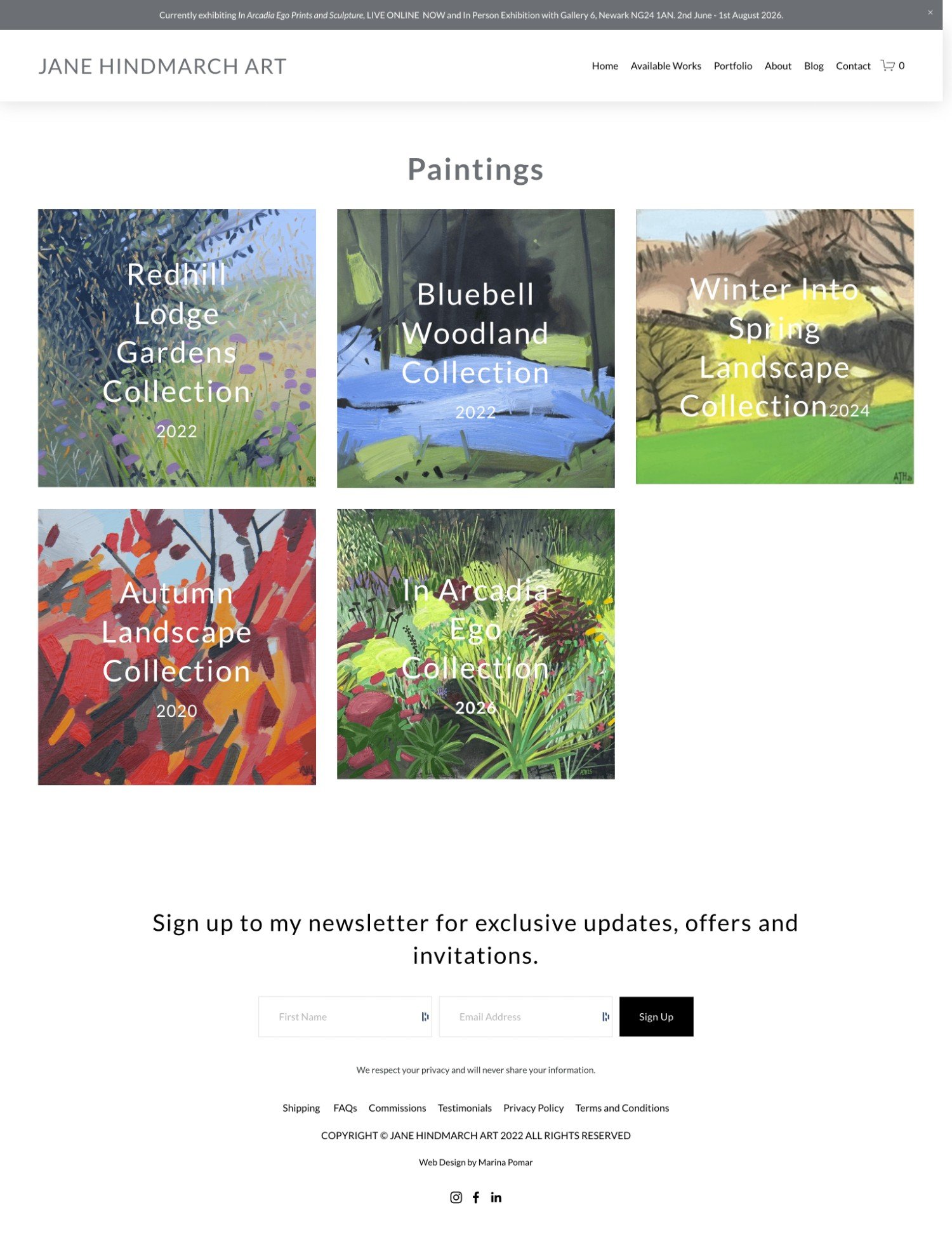
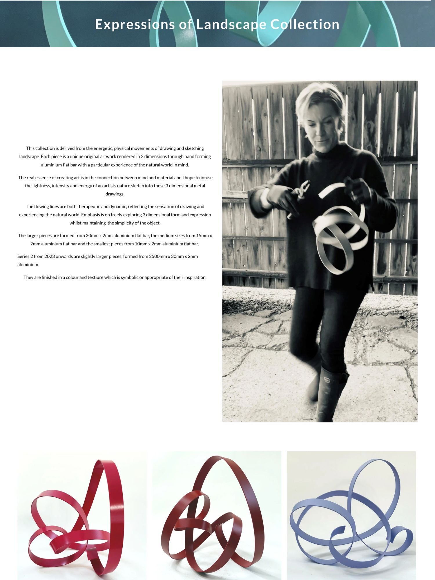
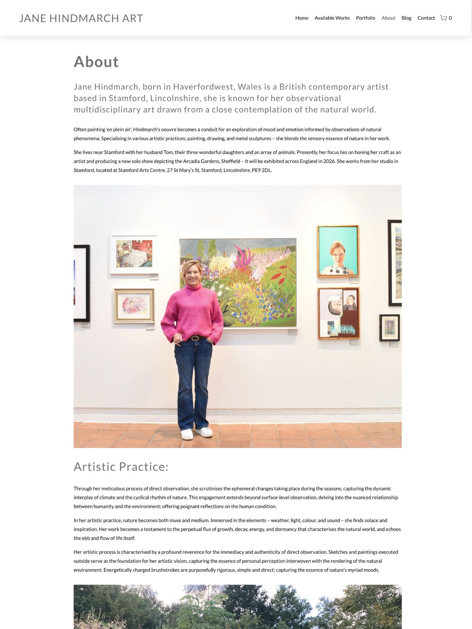
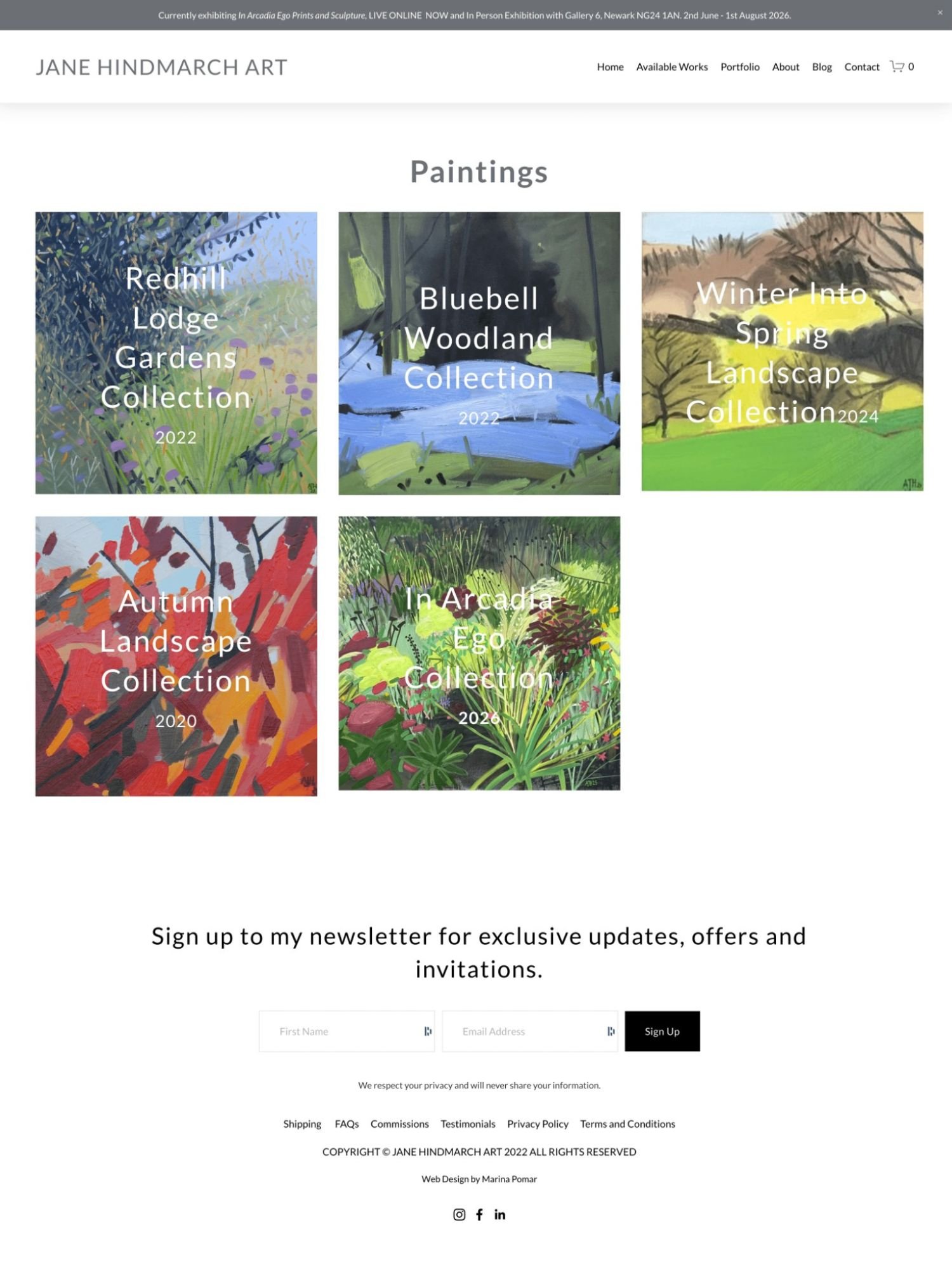
We redesigned Jane's whole website from the ground up, rebuilding the structure, the shop, and the way her work was presented throughout. A few details stood out to her in particular: giving her different bodies of work their own categorised space so visitors could browse by type and find their way back out again, a shop with detailed, multi-angle product views so someone could get as close to seeing a piece in person as a website allows, and a sliding image gallery on the homepage giving visitors a taste of everything Jane does without extra clicks.
Alongside the full rebuild, Jane wanted to be able to manage the site herself, so I walked her through the features and gave her step-by-step guidance and video tutorials for updating pages on her own.



The Results
The numbers speak for themselves. Jane now gets 50 to 60 visits daily, up from close to nothing before. Her average monthly traffic has grown from 433 visits in September 2022 to 1,200 visits now, a 177% increase. She's also picking up steady referral traffic from a blog she's featured in, and has started showing up in ChatGPT and Perplexity AI referrals, meaning people are discovering her through AI search too.
More importantly, she's making sales. In 2025 alone, she's had around four surprise sales through the website, people browsing, falling for a piece, and buying it, with no promotion from Jane at all. One came from a complete stranger she happened to meet in person while delivering another piece, who'd found her work through unrelated research and then bought a painting after browsing her site. A shop that stocks her sculptures and prints even had a staff member compliment her new website unprompted, someone who sees a lot of artists' sites in that role.
☾ Kind Words
“I feel much more confident sending people to the new website and I receive a lot of compliments about it as well.”
Jane Hindmarch
Multidisciplinary Artist

Beyond the Numbers
What's changed for Jane goes further than the traffic and sales. She feels more professional and more in control of how her work is presented, and believes she's losing fewer of the right kind of buyers than she used to. The redesign has also led to more opportunities with galleries. One of the biggest surprises has been how global her visitors are, people finding and buying her work from all over the world, often through routes she never expected.
She's also still using the tools I gave her. Over a year on, she still refers back to the video tutorials when she needs a reminder of how to update something herself.
"Your walk through to explain the features of the new website and step by step guidance with clear instructions about how I can update pages myself was invaluable," Jane says. "I kept it and it helped me understand how to do things myself when I referred to it even a whole year later."
The Takeaway
Jane's story shows what happens when a website stops being a jumbled list and starts working as an actual shop window, one that keeps working for you long after the launch. If your current site feels more like a dead end than a door for people to walk through, it might be time for the same kind of rethink.
"I would say that I'm sure they would not regret it at all," Jane says, of anyone considering working with me. "You really understood what I was trying to achieve with my website."
You Deserve a Website That Feels Aligned and Converts
If you’ve been sitting on your next version, the one that feels truer, deeper, more you, it’s time.
Your work deserves to be seen in its fullness.
And your website can be the sacred space where that next chapter begins.
Together, we’ll take your ideas (even the messy, half-formed ones) and turn them into a clear, beautiful, aligned website that feels like home.
You bring the heart. I’ll bring the structure, strategy, and soul-led guidance to hold it all together.
